The challenge
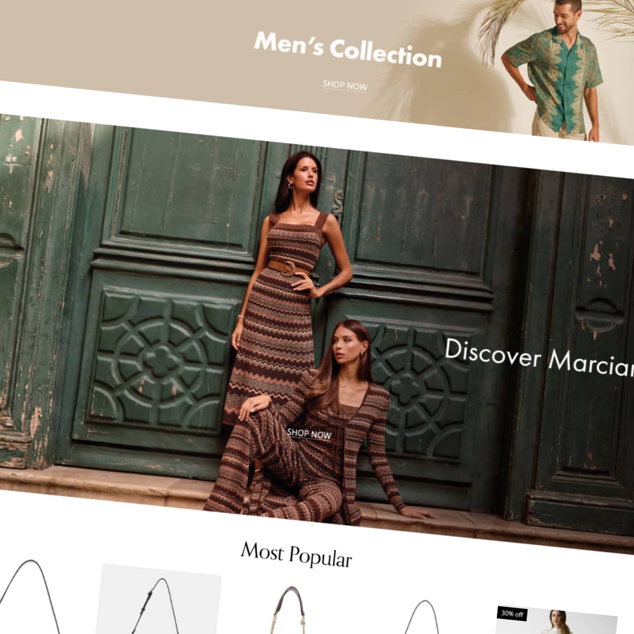
GUESS launched its eCommerce websites across the UAE, Saudi Arabia and Egypt using designs from its global team, working directly with our technology team without involving our in-house product designers.
A couple of months after launch, checkout conversion was poor, with too many customers leaving before completing their purchase.
I was asked to investigate what was going wrong and recommend improvements that would make checkout easier for customers across all three markets.
The issues
I audited the checkout on desktop and mobile, reviewed established eCommerce UX best practices, analysed customer feedback collected through Medallia and watched real customer sessions in Quantum Metric.
There wasn't one big problem. Several issues were making checkout harder than it needed to be.
1. Forced account registration
New customers had to create an account before they could make a purchase.
2. A lengthy checkout
The checkout was spread across three separate pages, adding unnecessary friction to the buying journey.
3. Difficult address entry
An unreliable address map, a 44-character field limit and missing local address requirements made entering delivery details frustrating.
4. A frustrating mobile experience
Too much scrolling, difficult tap areas and validation errors that only appeared after customers tried to continue.
5. Lack of customer reassurance
There was little reassurance around payment security or how to get help during checkout.
These findings gave me a clear picture of what needed to change and where to focus first.

The improvements
Using what I'd learned from the research, established eCommerce UX best practices and my experience designing for customers across the region, I focused on removing the biggest barriers to completing a purchase.
I worked closely with Engineering to make sure my recommendations were technically possible before presenting them to the local and global GUESS teams for approval.
Once approved, I redesigned the checkout in Figma, following GUESS's global design guidelines while adapting the experience to local customer needs.
1. Removing the account barrier
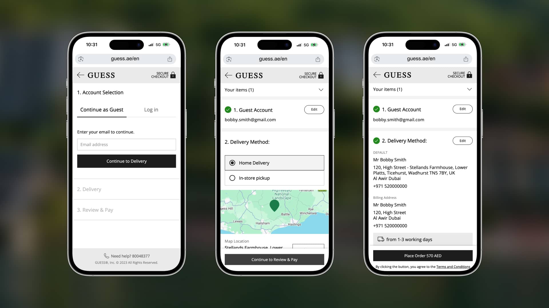
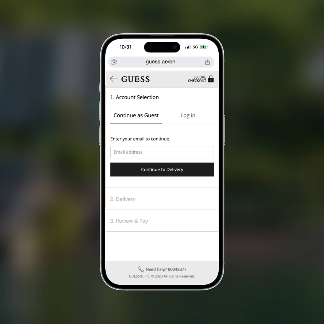
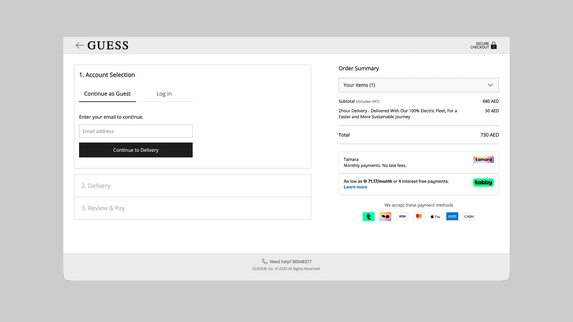
I introduced guest checkout as the default for new customers, while allowing returning customers to log in. New customers could create an account after purchasing by simply choosing a password.
2. Simplifying the checkout journey
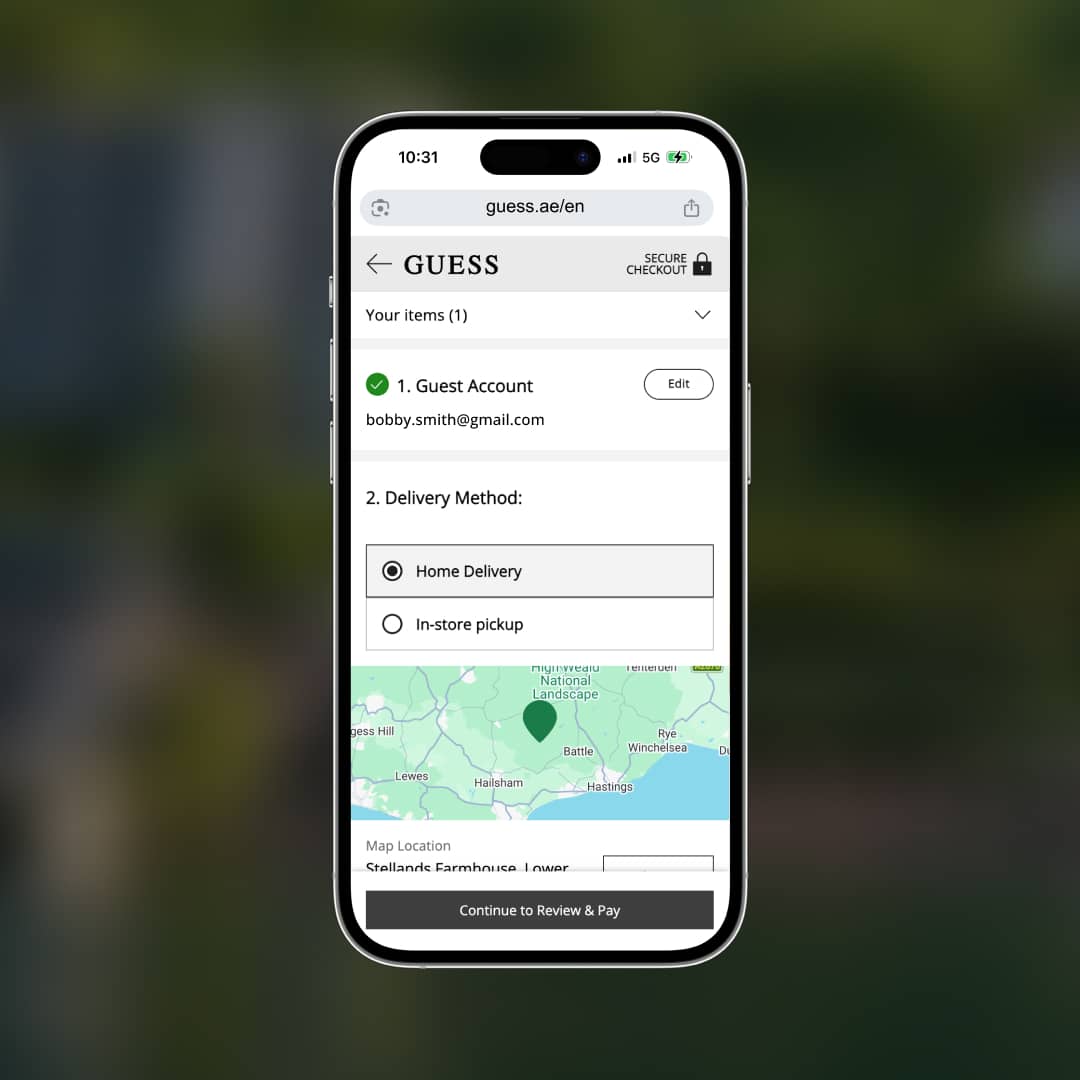
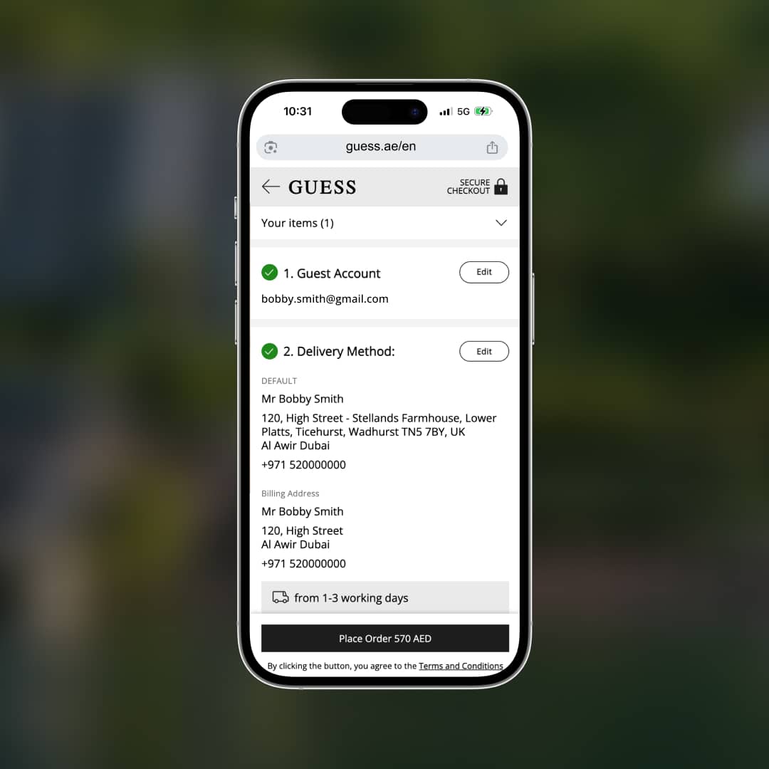
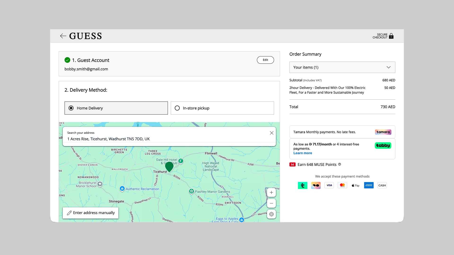
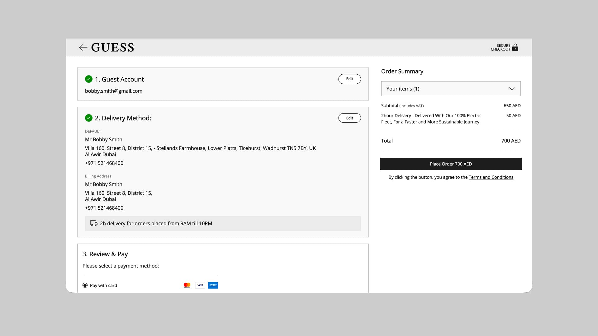
I replaced the original three page checkout with a single page experience, organised into three clear stages. I also simplified the header and footer to remove distractions and help customers focus on completing their purchase.
3. Fixing delivery and address entry
I removed the unreliable address map until it could be fixed, simplified the forms and removed the 44-character limit. I also tailored the address fields to each market, including support for Saudi Arabia's Short Address Code.
4. Making mobile checkout easier
I reduced unnecessary scrolling, improved spacing and made form fields easier to use on smaller screens. Inline validation also helped customers correct mistakes as they entered their details.
5. Building customer confidence
I added clear secure-checkout messaging, accepted payment methods and easier access to help, giving customers more reassurance throughout their purchase.


Product Manager, GUESS Chalhoub Group, Dubai


